
CEPT Style and Brand Guide
Introduction
Welcome to the CEPT family style guide. This comprehensive document replaces all previous guidelines and unifies our visual and written communication across CEPT, its three business committees (ECC, Com-ITU, and CERP), and its permanent office the European Communications Office (ECO).
Following this guide ensures a cohesive and professional brand identity that reflects our commitment to excellence in telecommunication, radio spectrum, and postal regulations.
How to use the guide
This guide is designed to help you maintain consistency in all visual and written communications for the CEPT family. Each section provides clear guidelines and examples to ensure the correct application of our brand elements.
Revision History
| Date | Version | Remarks |
| 01.10.2026 | 1 | Initial release |
Brand description
Who we are
The European Conference of Postal and Telecommunications Administrations (CEPT) is an organisation where policymakers and regulators from 46 countries across Europe collaborate to harmonise telecommunication, radio spectrum, and postal regulations to improve efficiency and coordination for the benefit of European society.
CEPT is a voluntary association of European countries that seeks to deliver greater efficiency through effective coordination, creating a dynamic market in European posts and telecommunications.
CEPT conducts its work through three autonomous business committees (ECC, Com-ITU, and CERP). The chairs of these committees form the organisation’s Presidency, supported by the central office, the ECO, in Copenhagen, Denmark.
The ECO provides expert advice and administrative support to CEPT, facilitating the effective and transparent development and delivery of its policies and decisions.
Our values
Professionalism: Upholding the highest standards of behaviour and ethics, committed to excellence, precision, and integrity.
Leadership: Leading the transformation of Europe's postal and electronic communications landscape through strategic initiatives and collaboration.
Collaborative Workforce: Believing in the power of collaboration, where the sum is greater than the parts.
Cohesion: Uniting diverse voices and harnessing their collective power as facilitators.
Facilitation: Providing a platform for dialogue, consensus-building, and decision-making to ensure smooth collaboration and effective outcomes.
Subtlety and modesty: Understanding that impactful leadership often comes from empowering others and working behind the scenes to support and coordinate.
Expert community: Valuing our greatest asset - our collective of experts whose knowledge guides our actions and strategies.
Written communication
Tone of voice and consistency
Consistency across communications: Consistency is essential in reinforcing the CEPT family brand and maintaining a uniform tone across all communication. It ensures that every piece of writing aligns with our core values and adheres to the guidelines established in this document. Consistency in language, tone, and style strengthens our brand identity and supports transparent and professional communication.
· Professionalism: Our tone is always professional and respectful. We use precise and accurate language to convey our commitment to excellence and integrity, ensuring our communications are credible and trustworthy.
· Facilitation: We speak confidently and clearly, demonstrating our role as facilitators in the telecommunications sector. Our language is decisive and forward-looking, inspiring trust and confidence in our audience.
· Collaboration: Our tone is inclusive and supportive, reflecting our belief in the power of teamwork and partnership. We use language that fosters a sense of community and collective effort, emphasising "we" rather than "I."
· Cohesion: We use a unifying tone that brings diverse voices and perspectives together. Our language emphasises harmony and the strength of working together towards common goals.
· Facilitation: Our tone enables and supports discussions and decision-making processes. We use language that helps facilitate understanding and consensus among our stakeholders.
· Subtlety and modesty: We communicate with humility and respect, avoiding boastfulness. Our language is modest and focused on collective achievements rather than individual successes.
· Expertise: Our tone is knowledgeable and informative, reflecting our deep expertise in telecommunications. We use technical language appropriately, ensuring it is accessible to our audience without overwhelming them with jargon.
Language usage
The language used in all CEPT family communications must be clear, precise, and appropriate for our audience. This ensures that our messages are easily understood and professionally presented.
· Plain English: Use plain English in all written materials. Keep sentences and paragraphs short, use everyday language, and avoid jargon unless necessary. When technical terms are required, define them clearly to ensure accessibility.
· Active voice: Employ the active voice to make communications more direct and engaging. For instance, "The CEPT team completed the project" is preferred over "The project was completed by the CEPT team”.
· British English: Adhere to British English spelling and grammar conventions. Examples include using "organise" instead of "organize" and "centre" instead of "center."
· Formality and tone: Tailor the level of formality based on the document type. Use a formal tone for official reports and technical papers, while a more informal tone is suitable for newsletters, social media, and internal communications.
Document structure
Headings and subheadings: Use clear and descriptive headings to organise content into sections. Subheadings should be used to divide sections further and should be formatted consistently.
Numbering: Number sections and subsections logically to guide the reader through the document. Sequential numbering, such as 1.1, 1.2, etc., helps maintain a clear structure for longer documents.
Paragraphs: Write in short, focused paragraphs, each covering a single topic. This enhances readability and keeps the document well-organised.
Tables and figures: Include tables and figures to summarise data or visually represent information. Label them clearly and include a brief explanation to clarify their relevance to the content.
Footnotes and references: Use footnotes or endnotes to add supplementary information without disrupting the flow of the main text. References should be cited appropriately, following the relevant style guide.
Appendices: Place supplementary details in appendices rather than in the main text. Reference these appendices in the main sections to guide the reader to additional information.
Longer documents
For documents exceeding 10-15 pages or those that are complex and detailed, include the following elements:
· Table of contents: start with a table of contents to facilitate easy navigation.
· Executive summary: provide a summary at the beginning to give an overview of the document’s key points.
· Numbered pages and sections: Ensure the pages are numbered, and the document is broken down into clearly numbered sections.
Document formatting
Line spacing
Select a line spacing between 1.15 and 1.5 that best suit your document's purpose and personal preference to ensure optimal readability and professional appearance. This flexibility allows you to adjust the text density to enhance clarity and ease of reading. However, for templates, always set line spacing to 1.15.
Paragraph spacing
Add spacing between paragraphs to separate them, improving the overall readability of the document.
Text alignment
· Primary alignment: The default for most text should be left-aligned, as this is the most readable format for long text passages. It’s especially suitable for digital documents, presentations, and most printed materials.
· Avoid centered text: Centered text is more complex and should be reserved for specific elements like headings, subheadings, or pull quotes. It should not be used for paragraphs or large blocks of text.
Bullet points
· Avoid single bullet points; if you only have one point, integrate it into the main text.
· Minimise punctuation within a bulleted list; a period is typically only necessary if the bullet point is a complete sentence.
· Begin each bullet point with a lowercase letter unless the point is a complete sentence.
· Numbered lists are best for sequential steps, while bulleted lists work well for non-sequential items of equal importance.
Images
Ensure the use of relevant images from the library that support the text and enhance the content's visual appeal. The images should be directly related to the content and help break up the text in a way that improves readability. Please find a selection of images in the ´image chooser’ in the Microsoft office package.
Punctuation and grammar
Full stops and commas
· Use a single space after full stops and commas
· Do not use full stops in abbreviations.
Inverted commas
· Use “double inverted commas” for direct quotes.
· Use ‘single inverted commas’ for emphasis or a quote within a quote.
· For quoted speech, open the inverted commas at the beginning of each paragraph and close them only at the end of the final paragraph if the speech continues across multiple paragraphs.
Hyphens and dashes
A dash (–) indicates a pause or break in a sentence, adding emphasis or setting off additional information. Insert a space on either side of the dash for readability. Be careful not to overuse dashes, as they can interrupt the flow of the text.
A hyphen (-) is half the length of a dash and is used to connect words or parts of words, such as in compound expressions (e.g., "well-known author"). Hyphens should also be used to avoid ambiguity in certain words (e.g., "re-sign" vs. "resign").
Avoid using hyphens in the following cases:
· Words starting with 'e', such as "email" instead of "e-mail."
· Adverbs ending in '-ly,' for example, "highly regarded" instead of "highly-regarded."
· Common compound words are now standardised without hyphens, such as "online" instead of "on-line."
· Prefixes, unless a hyphen is needed to avoid confusion, for example, "coordinate" instead of "co-ordinate."
Additional formatting details
Abbreviations and acronyms
Always write abbreviations out in full upon first use, followed by the abbreviation in brackets. An exception is made for abbreviations that are so familiar they are more commonly used in their shortened form rather than fully spelt out (e.g., MHz, GHz, Wi-Fi).
Acronyms are formed from the initial letters of a series of words and are typically pronounced as a word (e.g., "NATO"). Initialisms, on the other hand, refer to abbreviations formed from the initial letters of a series of words but are not pronounced as a word (e.g., "ECC" or "ITU").
In general, acronyms do not require the definite article "the" (e.g., NATO), whereas initialisms usually do (e.g., "the ECC", "the ITU"). Always use uppercase letters for acronyms and initialisms unless the organisation prefers lowercase.
See a complete list of abbreviations here.
Date and time formatting
Date: 23 November 2024.
Time: Use the 24-hour clock format: 08:00 and 14:00.
Figures and numbers
Write numbers ‘one’ to ‘nine’ and ‘first’ to ‘ninth’ in full. Use figures for ten and above.
The preferred format for numbers (use “.” for decimals): 1.00, 10.00, 100.00, 1000.00, 100000.00, 1000000.00.
Telephone numbers
Include the country code (preceded by ‘+’) followed by the subscriber number. Use the format the number holder prefers, e.g., +45 33 89 63 00.
Percentages
When writing percentages, use the word ‘per cent’. The symbol ‘%’ can be used in tables and formal deliverables.
This guide provides several CEPT family logo variants that suit different contexts and requirements. Each variant is crafted to ensure brand consistency across all communications while offering flexibility for specific applications.
· Primary CEPT Logo: This is the main logo, representing CEPT exclusively. It should primarily be used in formal communications directly from CEPT.
· Text-Only Logos: These simplified logos consist solely of text and are suitable for limited space or a minimalist design. The business units can use these logos in smaller digital formats, such as website footers or email signatures, as needed.
· Branded CEPT Logos: Each of the four business units under CEPT has a unique logo combining the primary CEPT emblem and the unit’s name. These branded logos allow each organisation to maintain its distinct identity while visibly aligning with CEPT’s brand. Business units may use these logos in their communications, ensuring a clear link to CEPT.
Logo variants:
· Full colour: This is the primary and preferred version of the logo for all general use, especially on the web and digital communications.
· Black and white: Perfect for use in documents, presentations, or simple designs where colour isn’t necessary.
· Negative white: A white version on a transparent background, ideal for dark backgrounds to ensure visibility.
File Formats:
· SVG: Scalable Vector Graphics (SVG) files are ideal for digital and web use where high resolution and scalability are needed. Use SVG files when logos are displayed at varying sizes, such as on websites or large screens, to ensure the logo remains sharp and clear.
· PNG: Portable Network Graphics (PNG) files are best for fixed-size digital uses, such as social media posts or email signatures. PNG files support transparent backgrounds and are ideal for applications with a smaller file size.
Each logo variant is available in multiple formats and resolutions to ensure optimal clarity across digital and social media platforms. Using the correct version and file type for each context helps maintain CEPT’s professional and cohesive brand image across all communications.
Practical guidelines for logos
· Placement: Place the logo in a prominent location, typically at the top left on documents.
· Clear space: Always maintain a clear area around the logo to prevent clutter. As a rule of thumb, leave a space equivalent to the height of the logo’s letters on all sides.
· Minimum size: To keep the logo clear and legible, avoid scaling it down too much. For digital use, the logo should be no smaller than 40px in height to ensure clarity on screens.
· Background colours:
o Use the full-colour logo on white or light backgrounds.
o For dark backgrounds, use the white (negative) logo.
o Avoid placing the logo on backgrounds with low contrast or busy patterns that may hinder visibility.
· Do’s and Don’ts:
o Do keep the logo proportional; avoid stretching or squashing it.
o Do not change the logo’s colours, apply shadows, rotate, or add any effects.
o Do not add other elements too close to the logo, as this may affect its visibility and impact.
Find all logos here. [link]
| CEPT |  |
| ECC |  |
| Com-ITU |  |
| CERP |  |
| ECO |  |
Colours
Colours of entities
Beyond our logos and distinct names, each entity within the CEPT family uses colours to establish its brand identity. These colours represent each entity’s specific character and focus while maintaining a cohesive appearance.
Given that several of our entities previously used shades of blue, we have continued this tradition by selecting a range of blue tones for our new palette. This choice respects our historical colour schemes and aligns with standard practices in our industry, where blue is often associated with professionalism, reliability, and trust.
Using these specific colours ensures that each part of the CEPT family is easily identifiable and retains its unique brand identity while contributing to a unified visual presence.
These are the five blue colours: 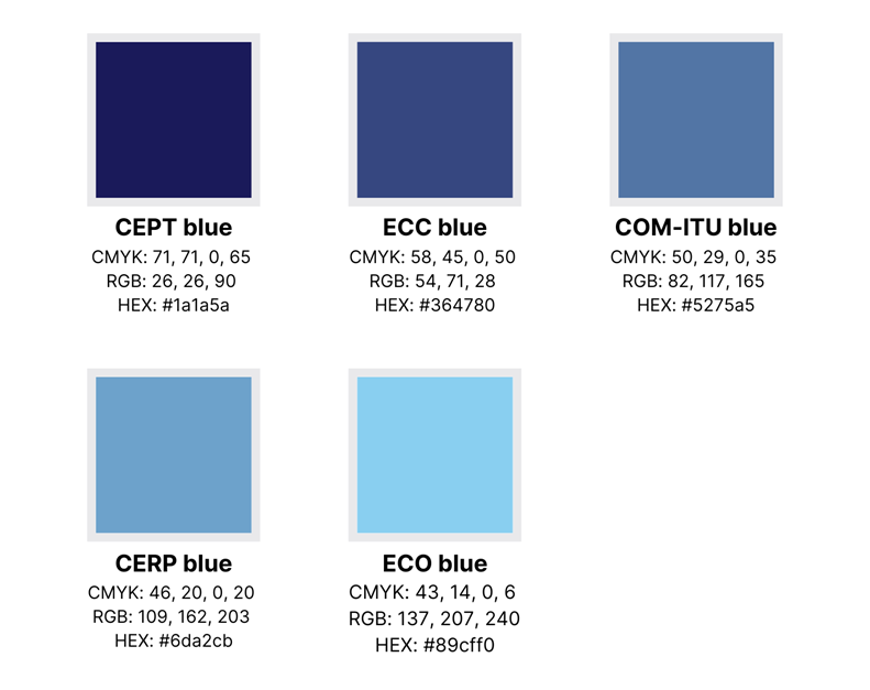
Example: 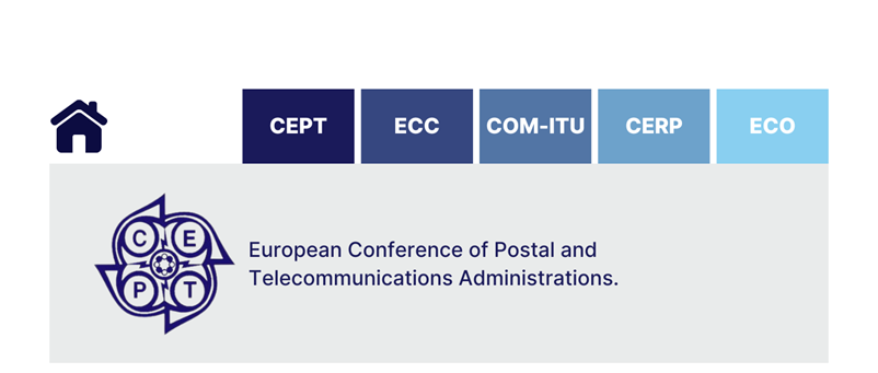
Basic colours
In addition to the five blue colours, we have five basic colours for use across entities: black, white and three shades of grey.
Grey colours are known for harmonising with a wide range of other colours, especially blue, which is often associated with professionalism and reliability. The grey tones create a neutral base that allows the blue shades to stand out and take centre stage, ensuring the visual identity remains clear and cohesive.
By consistently using these three primary colours across the web and office suite, we can maintain a professional and cohesive visual identity. The colours are versatile and can be adapted to various needs and media.
These are the basic colours. 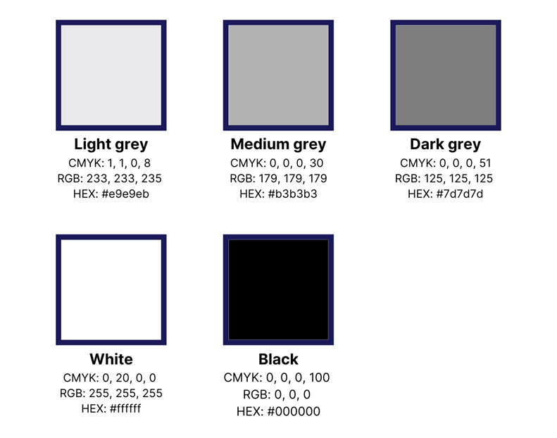
Practical guidelines for basic colours
Light grey / white
· Web: Use white as the primary background for web pages to ensure a clean, bright interface that allows blue elements to stand out.
· PowerPoint: Apply light grey sparingly in presentations, primarily for headers or small design elements, avoiding full-slide backgrounds to reduce ink usage when printing.
Medium grey
· Web: Use medium grey for secondary backgrounds, such as sidebars, footers, and less prominent sections. It can also be used to structure borders around images or boxes.
· PowerPoint: Apply medium grey for subtle background elements like headers or small design features, ensuring it contrasts nicely with lighter and darker shades. Avoid using it as a full-slide background.
Dark Grey
· Web: Dark grey is ideal for body text, subtitles, and captions, ensuring readability against lighter backgrounds. It’s also effective for links or buttons that need to stand out.
· Word: Use dark grey titles. It’s also suitable for borders and accent elements in documents.
· PowerPoint: Employ dark grey for key text elements like titles, bullet points, and essential information, ensuring visibility against lighter slide backgrounds.
Typography
Typography plays a central role in establishing a clear, professional, and cohesive visual identity across the CEPT family. To ensure both consistency and practical usability across platforms, CEPT uses a platform-specific typographic system.
Inter is used for all web and digital interfaces. It is a modern, highly readable typeface optimised for screen use, supporting clear hierarchy and accessibility across devices and screen sizes.
For desktop documents and presentations created in the Microsoft Office suite, Segoe UI is used. Segoe UI is the standard system font on Windows and is therefore available to all users without additional installation. Its visual characteristics are closely aligned with Inter, ensuring a consistent typographic appearance across platforms.
Font sizes are defined per platform to achieve visual consistency and readability rather than exact numerical matching. Due to natural differences in font metrics between typefaces, sizes may vary slightly between web and Office applications while maintaining the same visual hierarchy.
Practical guidelines for web
Font: Inter
Body Text: 16px, Regular, black
H1: 32px, Bold, dark grey
H2: 24px, Bold, dark grey
H3: 20px, Semi-Bold, dark grey
Call-to-actions*: 14px, Semi-Bold, dark grey
Footnotes: 12px, Light (300), medium grey
* A call-to-action (CTA) on a website is a prompt that encourages users to take a specific action. Examples include signing up, learning more, clicking here, downloading, and contacting us. These CTAs should be clear, concise, and stand out visually to guide users effectively.
Practical guidelines for Office Suite
Font: Segoe UI (Windows Default)
Word:
Body Text: 12pt, Regular, black
H1: 20pt, Bold, dark grey
H2: 16pt, semi-bold, dark grey
H3: 14pt, medium (500), dark grey
Hyperlinks: standard hyperlink blue
Footnotes: 9pt, Light (300), medium grey
PowerPoint:
Title slides:
Title: 44pt, Bold, dark grey
Subtitle: 24pt, Regular, medium grey
Content slides:
Headings: 32pt, Bold, dark grey
Body: 20pt, Regular, dark grey
Footnotes: 14pt, Regular, medium grey
Graphic elements
Icons
Below are some examples of the icons you can choose from. We work with two different formats for icons, each with its own advantages:
· SVG: This format is good because it can be resized to any size without losing quality. It’s optimal for websites where icons must look sharp at any size.
· PNG: This format is used when the icon's size is fixed and high-quality details, such as transparency, are required. It is ideal for presentations or printed materials where the icon's size won’t change.
Using both formats ensures that our icons look good no matter where they are used.
All icons can be found here. [link]
Illustrations
Illustrations and graphic elements can be used for presentations and other places that need visual support. They can be found here. [link]
Social media
This style guide section focuses on creating content for our LinkedIn page. Here, you will find guidance on content formats and pillars to ensure our communications are engaging, professional, and aligned with our brand values.
In the following sections, you can find inspiration on different content formats and practical tips to maximise their impact. Additionally, we outline selected content pillars that can inspire themes and topics for writing.
Following these guidelines will help maintain a consistent and impactful LinkedIn presence that supports our organisational goals.
Content formats
· Documents: These are created as PDFs, with around 12 slides with 25-50 words each. Add text when posting, but ensure the overall length of the text is under 500 characters.
· Videos: The ideal length is 1-2 minutes. Focus on the first 8 seconds to capture attention and include a clear call to action.
· Text + Image: Ideal text length is 900-1,200 characters. Use genuine photos and limit images to five.
· Articles: Aim for 800-1,200 words with short paragraphs and headlines. Publish on weekdays and optimise for SEO.
Content pillars
· Personal stories: Humanise the brand with personal stories and experiences.
· Thought leadership: Share in-depth knowledge through white papers and articles.
· Industry insights: Use third-party content to inform the audience about industry trends. When incorporating third-party content to provide industry insights, ensure you have the appropriate rights or permissions. Properly attribute the content to its source and verify its accuracy and relevance to maintain the trust and professionalism of our communications.
· Product/Service highlights: Update on product specifications and new releases.
· Event announcements: Communicate company-organised events and employee participation.
· Employer branding: Highlight career opportunities and company culture.
· Customer-generated content: Leverage reviews and testimonials.
· Behind-the-scenes: Provide a glimpse into daily operations and company culture.
For a more thorough explanation of using LinkedIn, please see Appendix 2, Social Media Strategy and Management Guide.